Brand Standards
Brand standards, also known as brand guidelines or brand manuals, are a set of rules and guidelines that dictate how a brand should be represented and communicated across various channels and touchpoints. These standards are essential for a variety of reasons:
Consistency: They ensure a uniform look and message across all brand touchpoints.
Professionalism: They project a polished and trustworthy image.
Identity: They define and reinforce the brand's unique personality and values.
Recognition: Consistency leads to easy brand recognition.
Efficiency: They streamline marketing and design efforts.
Adaptability: Standards can be tailored to various media.
Legal Protection: They safeguard intellectual property.
Consumer Trust: Consistency fosters trust.
Employee Guidance: They provide clear guidelines for employees.
Competitive Advantage: Brands with strong standards stand out in the market, gaining an edge.
Brand standards are crucial for maintaining a consistent and effective brand presence. They help shape the brand's identity, increase recognition, and build consumer trust, which can ultimately lead to business success. The following assets are here to help you adhere to the Harbor brand, and to ensure you have a better grasp of how we appear in the marketplace.
OUR PURPOSE & MISSION
Fortifying Community.
Harbor Foods’ companies are dedicated to supporting the local entrepreneurs that provide jobs in their communities, bring convenience to busy lives, and invite us all to experience life around the table. Every day.
CORE VALUES
Genuine. Motivated. Resourceful. Friendly.

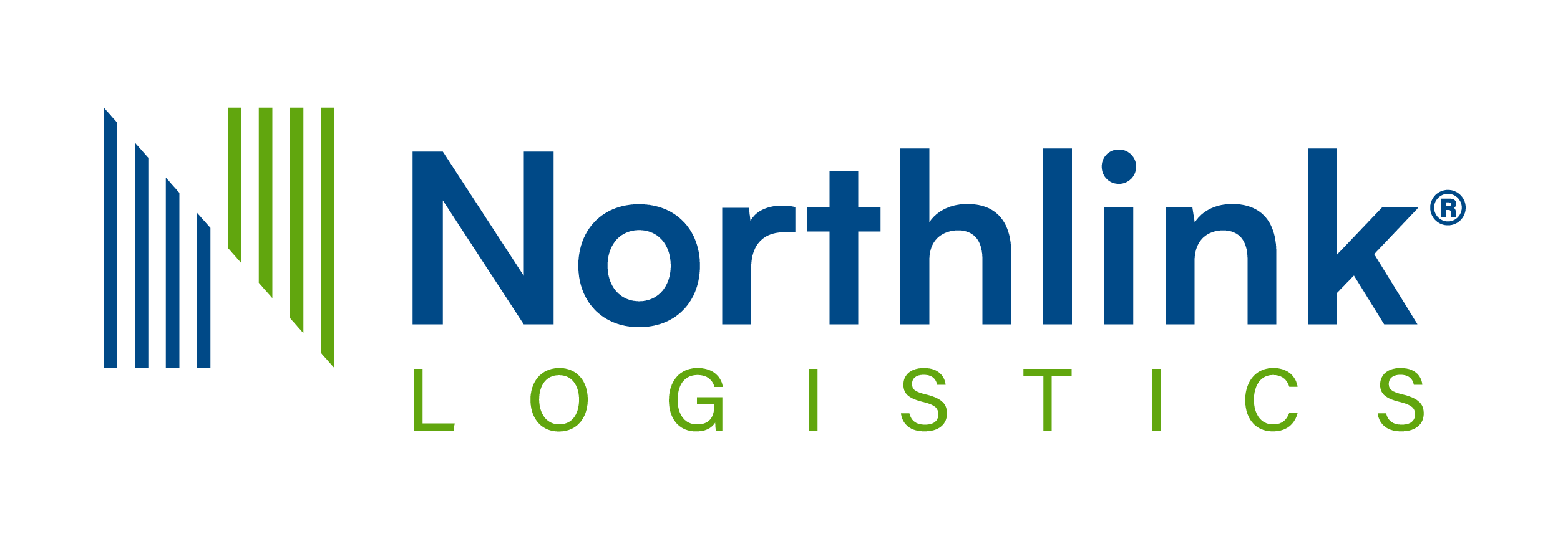
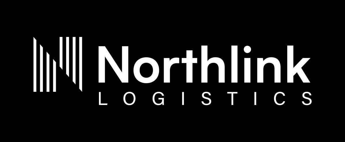
Harbor Logos
When using any Harbor branded logo's, use primary versions whenever possible. If using logo's against a darker background (or dark photo area), please use the "reversed" versions. These are white with a transparent background. To download, click on the "download" text to open the image. Now right-click (or Control-click) and select "Save image as..." to download the file.
Foodservice Logo | Delivering Goodness | Life happens | HarborCares | Harbor Wholesale | Harbor Foods | Northlink
Improper Logo Usage
Please DO NOT
Do not change the proportions of the "H" bug and the text.
Do not stretch the width of the logo.
Do not stretch the height of the logo.
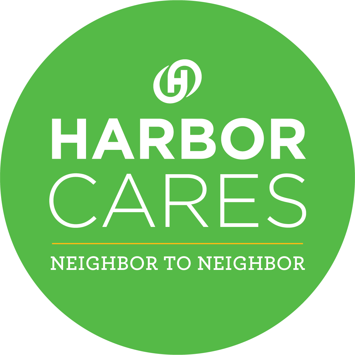
The logo for HarborCares should be used where applicable.
HarborCares logo
Harbor Wholesale Logos
When using any Harbor branded logo's, use primary versions whenever possible. If using logo's against a darker background (or dark photo area), please use the "reversed" versions. These are white with a transparent background. To download, click on the "download" text to open the image. Now right-click (or Control-click) and select "Save image as..." to download the file.
Harbor Wholesale logo color
Harbor Wholesale logo reversed
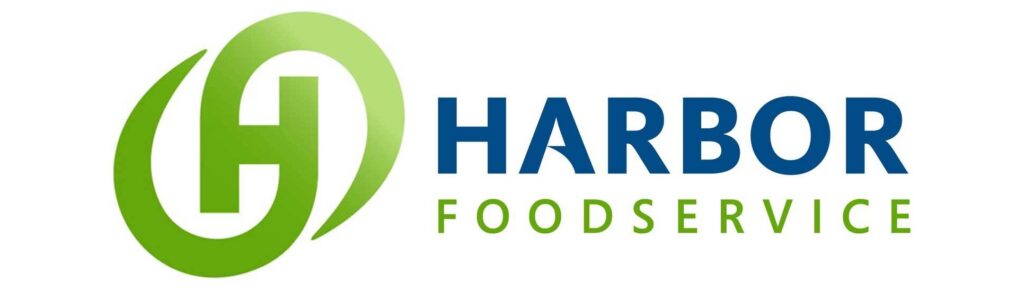
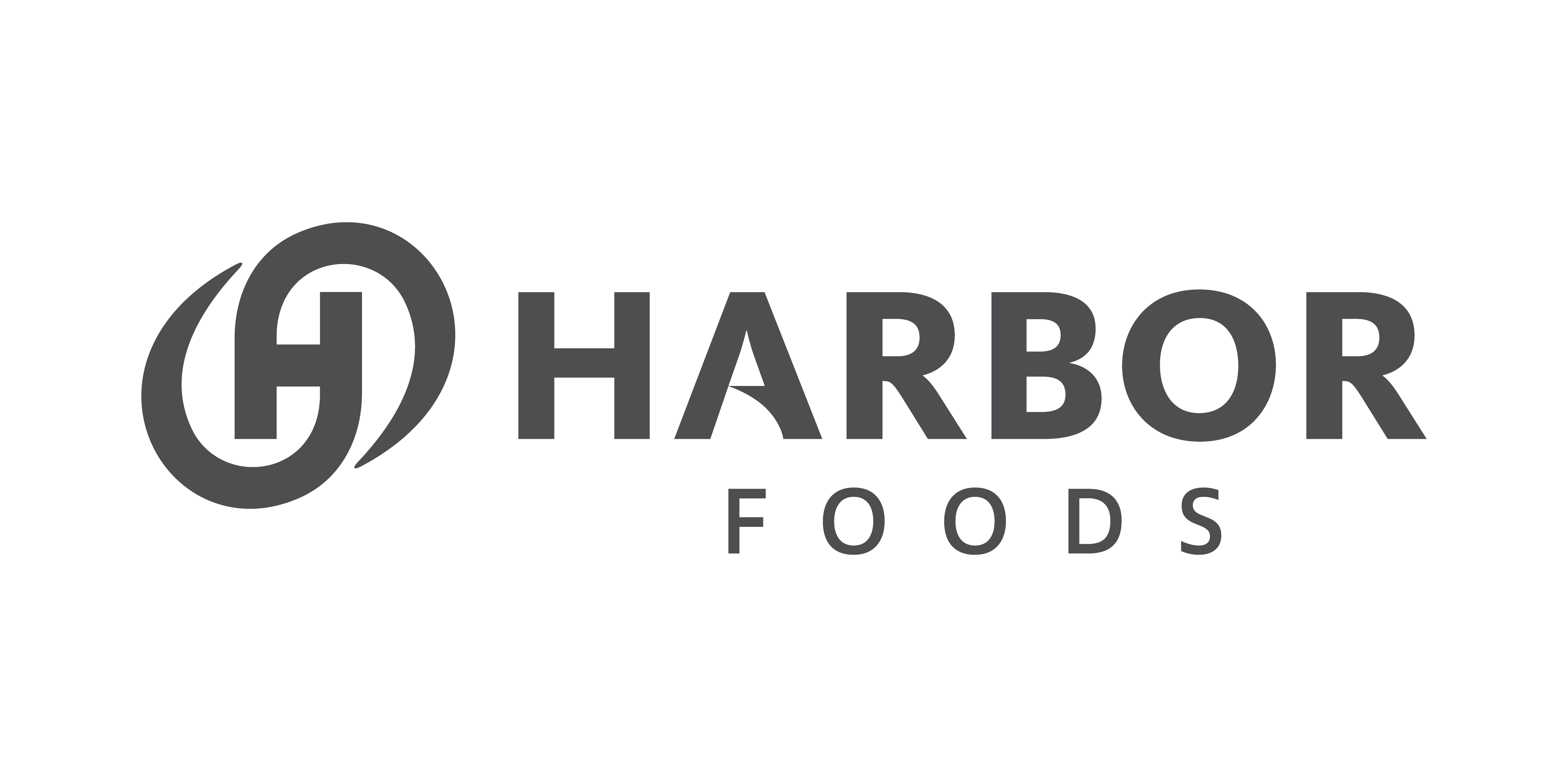
Harbor Foods Logos
The Harbor Foods logo has 2 variations, one as a stand alone and a second with the family of companies beneath. If the logo is to be used at a smaller size, please use the Harbor Foods without the family of companies.
Harbor Foods Logo
Harbor Foods Logo Reversed
Harbor Foods Family of Companies
Harbor Foods Family of Companies Reversed

Typography
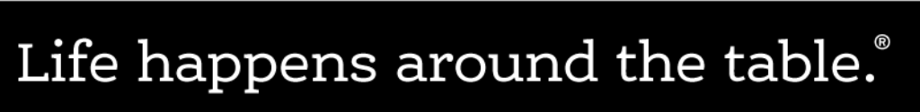
The 2 main fonts used in Harbor Foodservice marketing are Montserrat and Ernestine, both from Adobe. Ernestine is a slab serif font with unique numbers while Montserrat is a contemporary sans serif font. They should be used when possible for customer facing collateral. The tag lines for "Life happens around the table" and "Delivering goodness" are both set in Montserrat. You can download a graphic version of these tag lines for use in your material below.
Life happens around the table.®
The text "Life happens around the table." is a Registered Trademarked by Harbor and should include a "circle R" where possible. It is set in Adobe Montserrat. Please download and use the graphic version for convenience.

Life happens around the table text
Life happens around the table text reversed
Delivering Goodness™
The text "Delivering Goodness" is Trademarked by Harbor and should include a TM where possible. It is set in Adobe Montserrat font. Please download and use the graphic version for convenience.

Delivering Text @ 25% watermark

Delivering Text @ 85% tint

Delivering Text reversed
Harbor Colors
The Harbor Foodservice color scheme is green, blue and gray with highlights of gold (used sparingly). You can see the colors below and how they are constructed via various software packages. Please adhere to these versions of the colors when building your material.
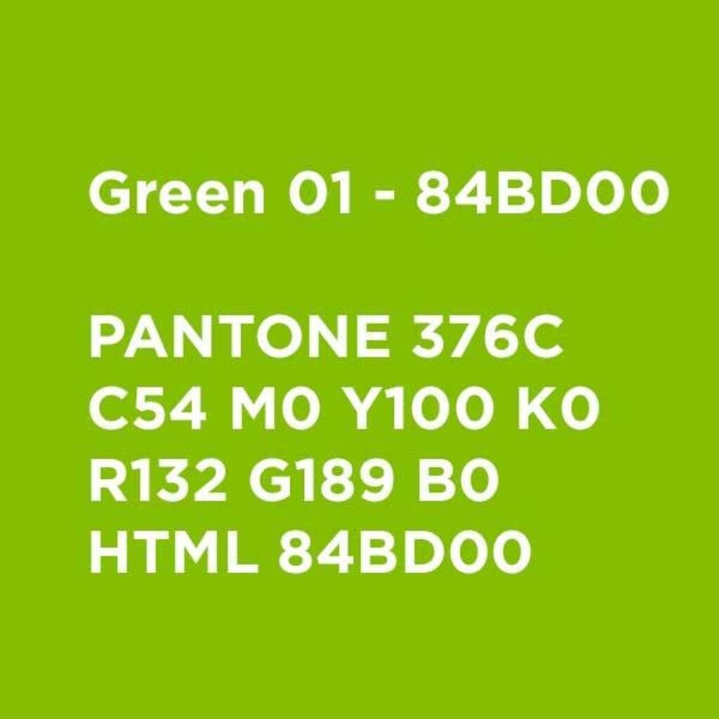
Harbor Primary Green Color
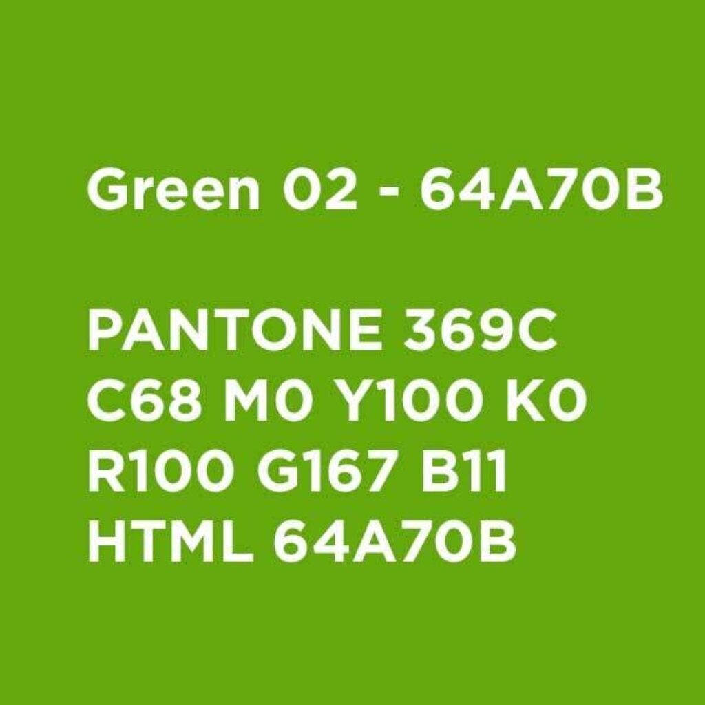
Harbor Secondary Green Color
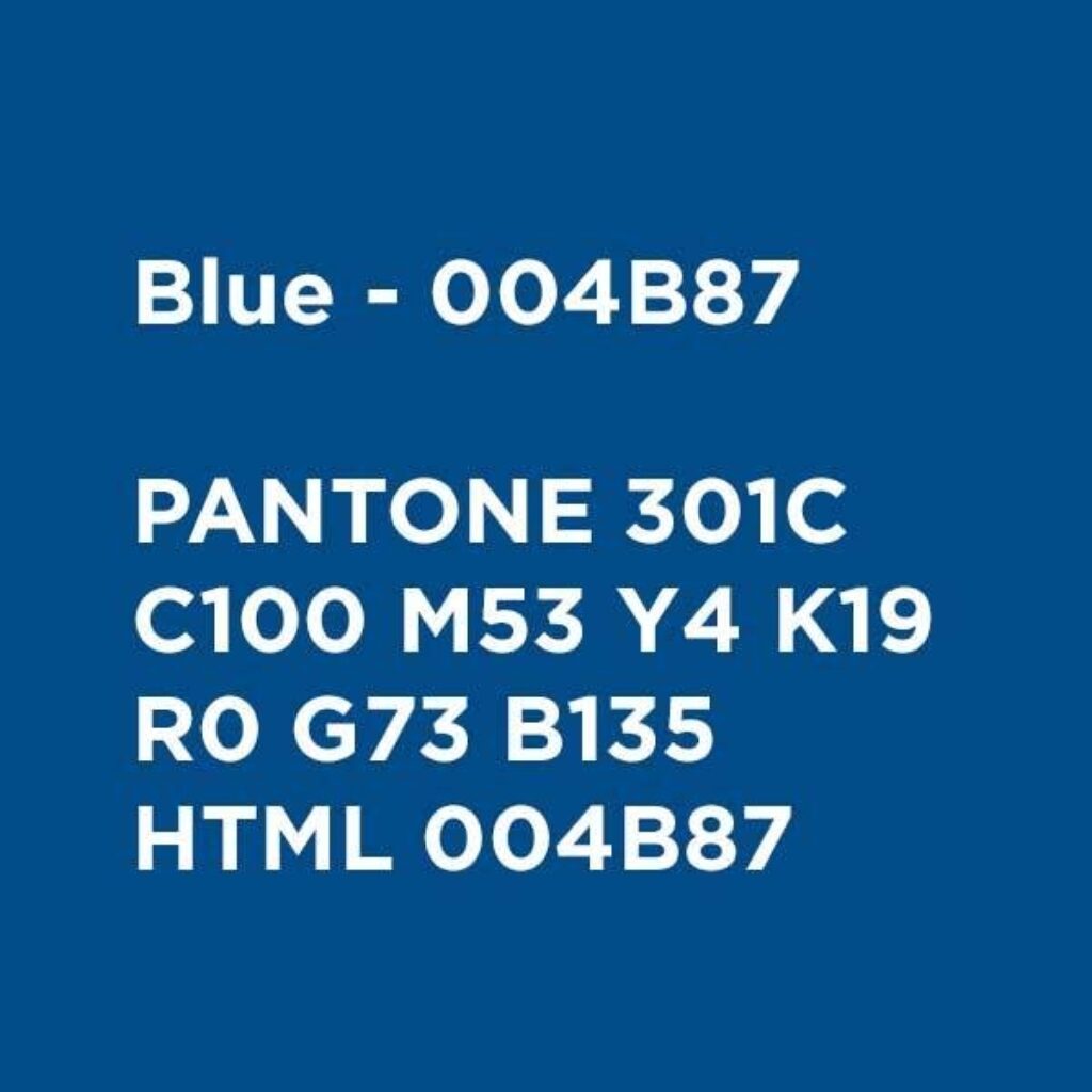
Harbor Secondary Blue Color
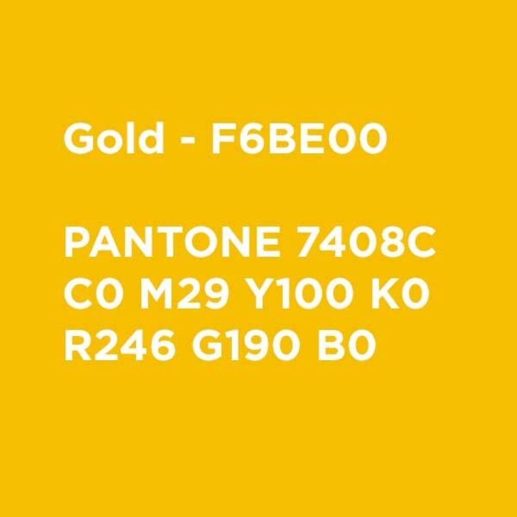
Harbor Secondary Gold Color
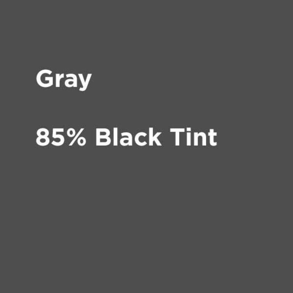
Harbor Secondary Gray Color
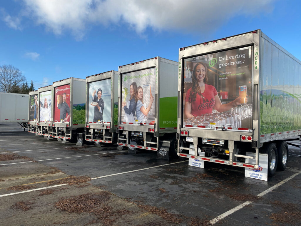
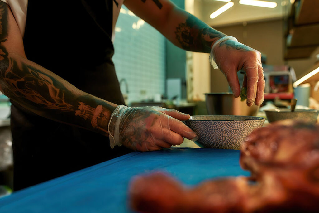
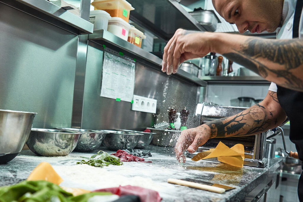
Photography
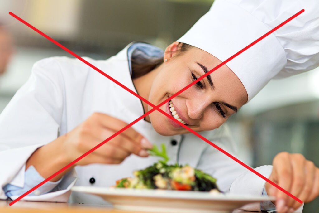
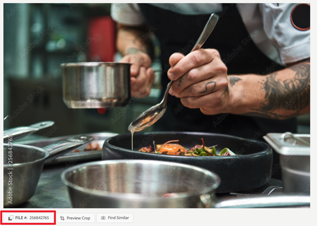
The goal when using photography to represent Harbor and its values, is realism and diversity. We try and keep chef images vague with close ups of hands and products. It is very common these days for chef's to have tattoo's on their arms. We also strive to include various races. We don't use overly staged images or obvious models when representing Harbor. See below for examples.
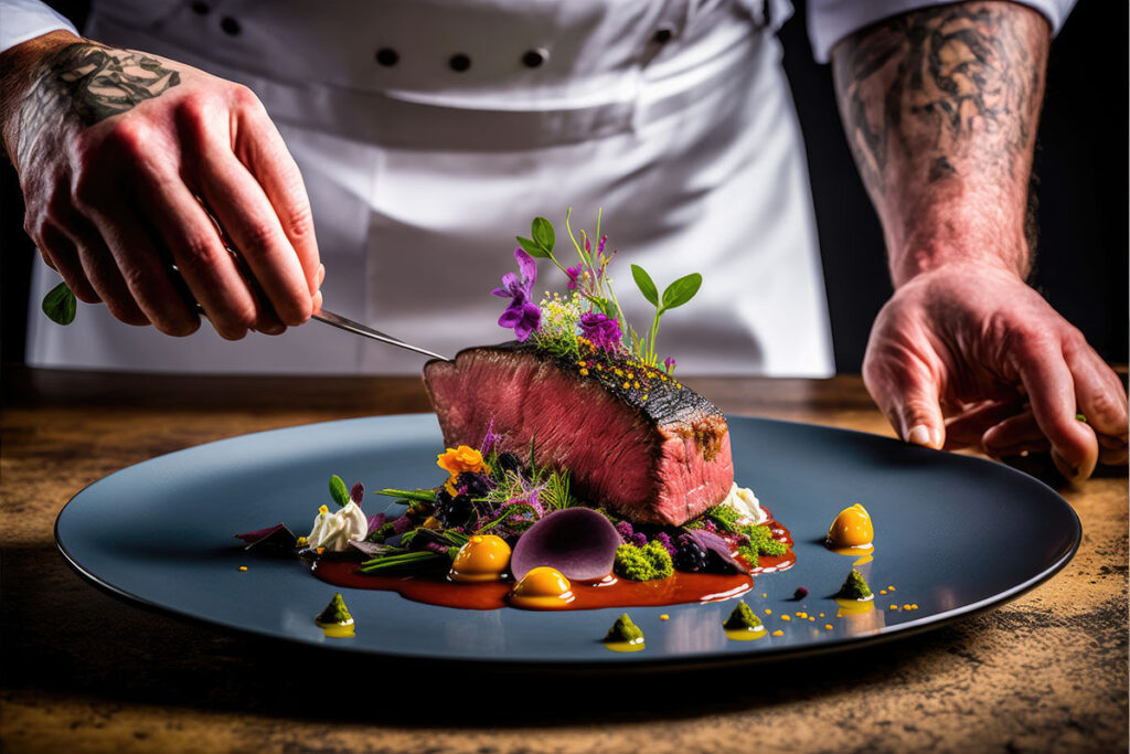
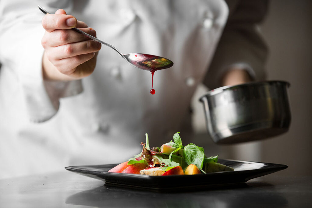


DO NOT USE
Please do not use staged images or obvious models when representing the Harbor brand. If you have a need for images, you can choose them from our Adobe stock account and then request a high res version using the marketingrequests@harborfoods.com email. Please include the photo ID located in the bottom left corner after you have clicked on the image thumbnail.

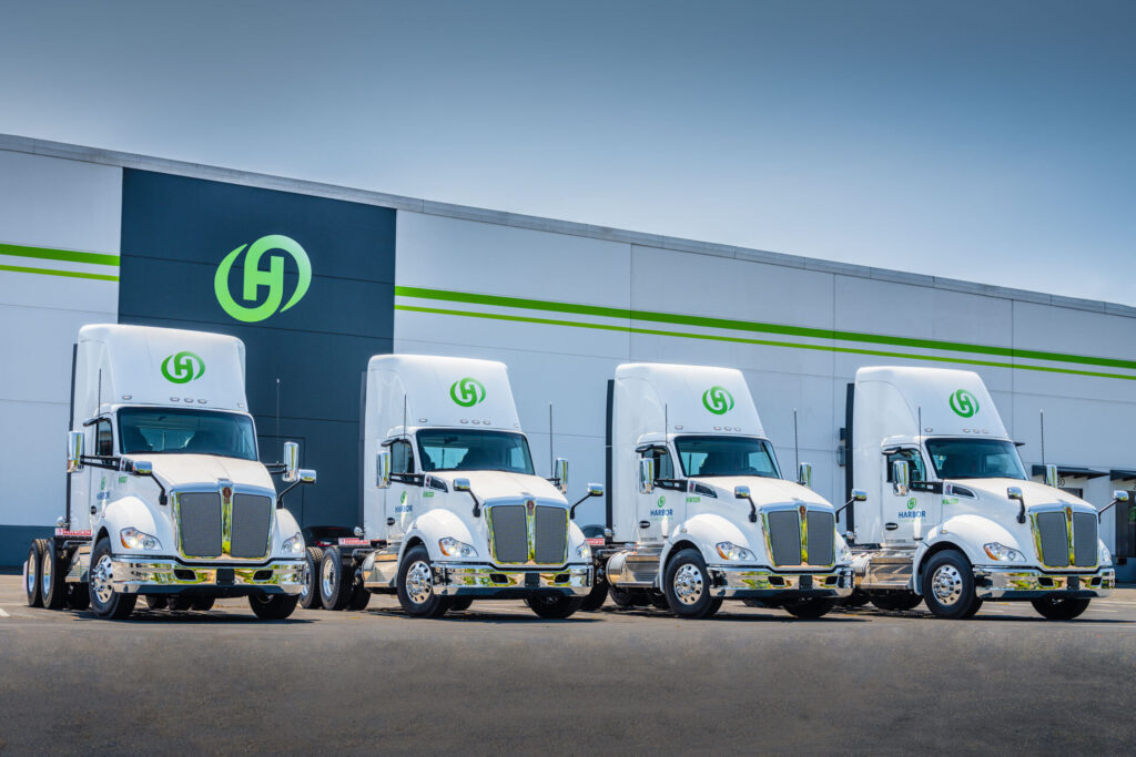
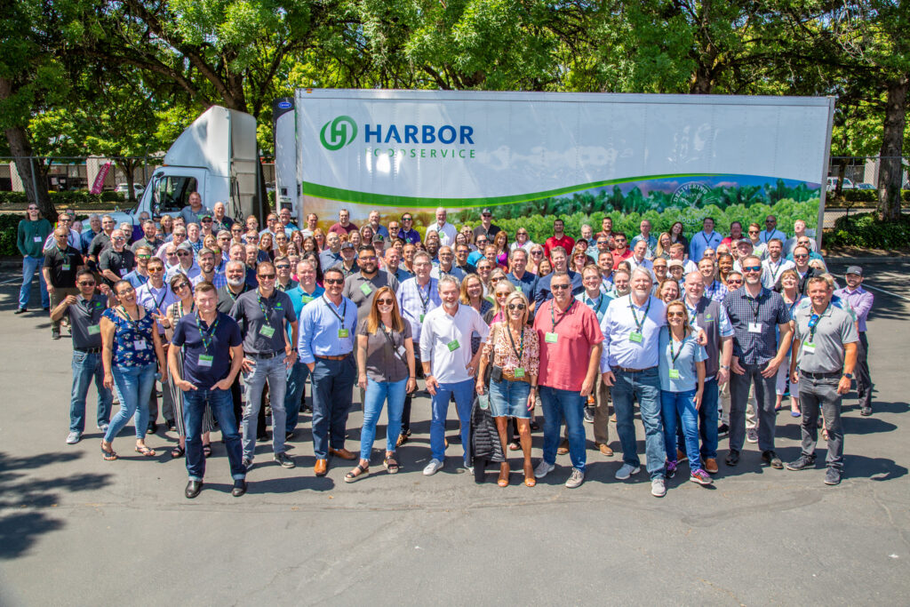
Available Images
The following images are available in high res format to download and use with your projects.
If you would like an image to use, reach out to marketingrequests@harborfoods.com